Coloured glass magnetic boards aren’t the only way to brighten up a workplace. Here are five ways you can better put colour to use in the office.
Coloured glass magnetic boards in the workplace
Magnetic Coloured glass boards and other ways to help offices pop!
Colour plays an important role in our day-to-day lives. Everything from traffic lights to emergency signage to Instagram filters relies on our use and understanding of colour.
But what about workplaces? Apart from your shiny new coloured glass magnetic board, how else can you bring colour into a workplace? And why does it matter?
The answers might surprise you. Here are five reasons you should be paying attention to colour at work...
1. Establish your brand identity
Branding, by definition, is a marketing strategy in which a business creates a name, symbol and design that’s distinctly identifiable as belonging to that specific business. The aim of branding is to make a business or product distinguishable from its competition.
A great brand is the backbone of many businesses. If you run one of these, you know the brand influences how people perceive your company, boosts audience awareness of your product or service and that it can even drive new business.
In branding, colour is king. There’s a reason we associate red and yellow with MacDonald's for instance – they’re established brand colours that make the restaurant immediately recognisable. The same principle applies to your own business: if you want people to recognise your company, you have to establish your brand colours. Once established, those colours should be used consistently.
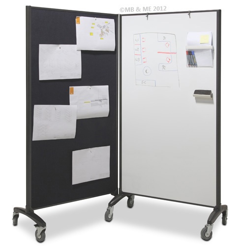
Signage and promotional materials are the obvious canvases for your colours, but you should also consider their use throughout your workplace. Consider decor, such as couches, and fixtures, such as glass whiteboards – would they benefit from being in your brand colours?
After all, a brand is only as good as its consistent use, and your workplace is one place you can extend that influence.
2. Influence mood and productivity
A recent study out of the University of Texas found that bland beige, grey and white offices induced feelings of sadness and depression. Not what you want.
In fact, the human perception of colour has proven impacts on mood, behaviour and even productivity. With so much at stake regarding the colour of your workplace walls, it pays to choose your office colour scheme carefully.
Low-wavelength colours like green and blue - each common in nature - have been proven to improve efficiency and focus. They also inspire an overall sense of wellbeing in the viewer. Bottom line: if you want to promote focus and efficiency in your workplace, green and blue are wise choices.
At the other end of the scale are warm colours like red and orange. These hues inspire action, attention and passion. If you need people to pay attention to something in the office, red is a great colour for the job.
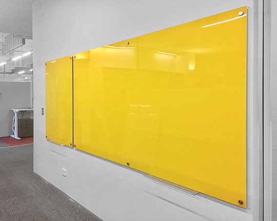
Yellow, meanwhile, is said to be the colour of optimism and energy. Colour psychologists recommend its use in offices where artists, writers, developers, designers and other creative professionals work.
Whatever colour you choose, the professionals preach balance. Opt for a colour scheme that combines the strengths of low and high wavelength colours.
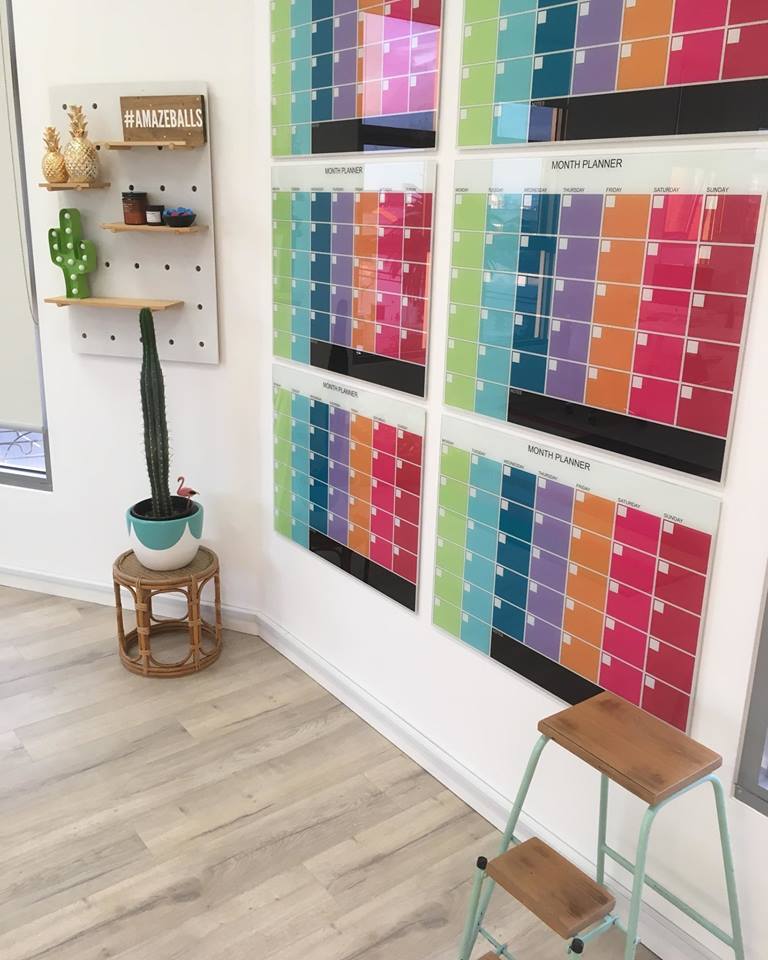
● Is your meeting room painted in cooler tones? Why not add a pop of warmth with a brightly coloured magnetic glass board?
● Is your warm-toned feature wall doing the trick already? Why not cool the area with a blue or green couch?
3. Better establish setting
Different areas of your workplace serve different purposes. You wouldn’t eat lunch in the meeting room just as you wouldn’t hold a work-in-progress meeting in the kitchen.
Applying different colour schemes to different areas of your office is a great way to establish the setting of each area. Some recommended colour schemes include:
 Reception areas and waiting rooms
These areas are your “first impression” spaces. They’re often the first thing a prospective client sees and should be designed with this in mind.
To create a welcoming first impression, make use of your brand colours. If your branding is particularly bold, opt for pops of bolder branding colours complemented with softer hues. Avoid stark white rooms lest you inspire a clinical, bland first impression.
If neutrals are more your cup of tea, make sure to use rugs, artwork, plants and colourful decor to inject personality and make a memorable first impression.
Need a quick splash of colour? Why not opt for a coloured glass whiteboard behind your reception? It can even be a great place to have a glass noticeboard.
Workspaces
Cool colours are an optimal choice for workspaces because they boost concentration, minimise anxiety and inspire productivity. That said, too much cool and you can easily tip from relaxing to melancholy.
To balance out your scheme, include some warm elements and accents to up the space’s energy levels. If your walls are blue or green, add bright pops of colour with desk chairs, rugs or paintings. It’s a great way to attract the eye and boost the mood.
Meeting rooms
Green is the colour of choice when it comes to meeting rooms. The natural hue promotes collaboration and concentration – both integral to any productive meeting. This is why our green coloured magnetic glass boards are a best-seller!
Breakout spaces
Breakout spaces such as staff lounges, kitchens or even hallways are great areas to experiment with colour without detracting from day-to-day productivity. From a statement purple hallway down to a sunny yellow kitchen, smaller spaces are ideal canvases for playful colour picks that invoke optimism and stimulate energy.
4. Be more accessible
Accessibility, in this context, refers to the design of products, devices, environments or services for people with disabilities. Essentially, it’s actively creating a world that’s easier for people to navigate, no matter their ability.
Colour is an important tool when it comes to accessibility, but it can also prove an obstacle in the wrong hands. When using colour in the workplace - whether it be on powerpoint slides or writing on your coloured glass magnetic board - you have to abide by two rules:
1. Never use colour alone to show emphasis
When you use colour alone to show emphasis you run the risk of alienating people who are colour blind or who have low vision – they might not be able to properly differentiate the colours you’re using. Instead of relying solely on colour for emphasis, consider alternative methods such as:
● Writing in capital letters
● Underlining
● Italics
● Using a thicker pen.
2. Ensure your colour use has strong contrast
Proper contrast between background and foreground elements is essential for accessibility. If you’re writing on a green coloured magnetic glass board with a grey marker, for instance, you’re going to trip up some viewers who might not be able to discern the difference in shades.
5. Use colour association
There are two main ways through which we derive the meaning of colours: natural association and cultural/psychological association. Both are important to understand when using colour in your workplace.
Natural association
The natural association of a colour is the way we connect meaning to colours as they appear in the natural world. We associate blue with the sky or the ocean, for instance. Green might mean forests or it could mean an ominous storm. Yellow light can be a fire or a sunrise. All these associations are natural as they pertain to the world around us.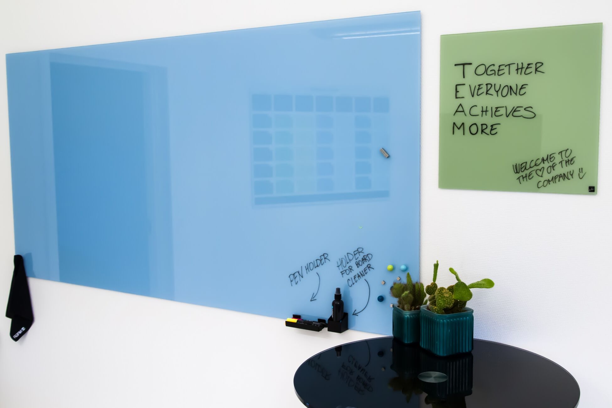
Cultural/psychological association
Cultural or psychological association is the meaning we attach to colours based on what we’ve been taught. These lessons can come from many places: religion, school, culture and more.
When using colour, it’s a good idea to understand the underlying associations it has. Some associations might come easily: writing in red pen is typically associated with grading school papers here in Australia.
Some might be a bit trickier, particularly if you’re addressing a culture you’re not familiar with. When designing an office in China, for instance, you’ll probably want to steer clear of a yellow feature wall.
Harness the power of colour with a coloured magnetic glass board
Colour is an incredibly powerful tool. It can drive productivity, uplift moods, establish settings and forge associations. Harnessing the power of colour in the workplace is a great way to ensure your environment is a happy, productive one.
So how about it? Ready to harness the power of colour? Why not start with a coloured magnetic glass board from JustBoards?
Get in touch today! Great service, great prices and Australia-wide delivery to your door. Call us today on 1800 654 917 or send an email to [email protected]