We will help you find the best solutions
This is our promise.
We will help you find the best solutions
This is our promise.
We offer FAST & FREE ground floor delivery for orders over $150* on our wide range of whiteboards, glassboards, pinboards, and display products—available across Brisbane, Sydney, Melbourne, Adelaide, Perth, Hobart, Darwin, Canberra, and selected surrounding metro areas (*some exclusions apply).
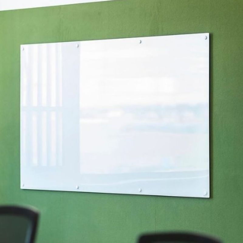
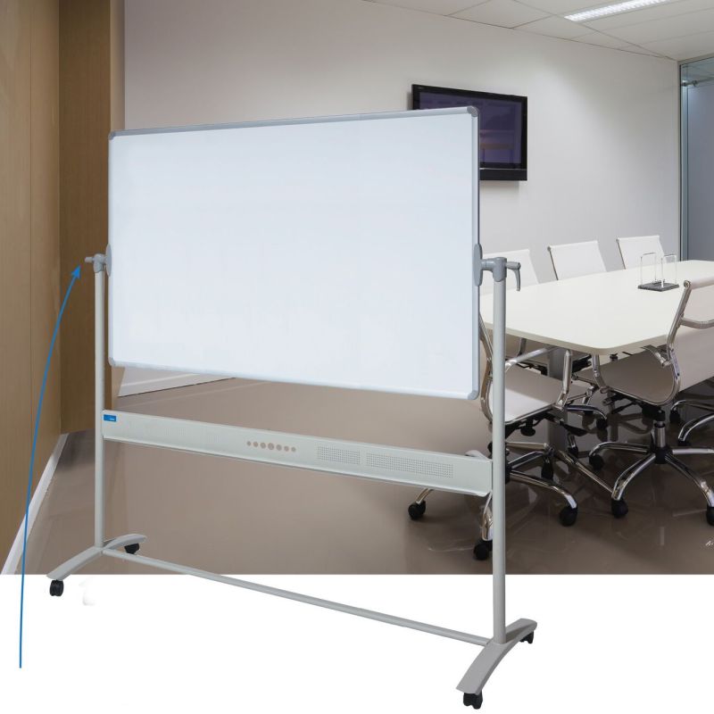
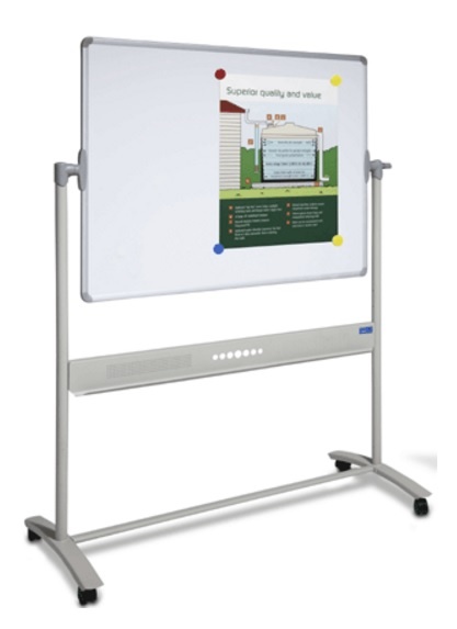
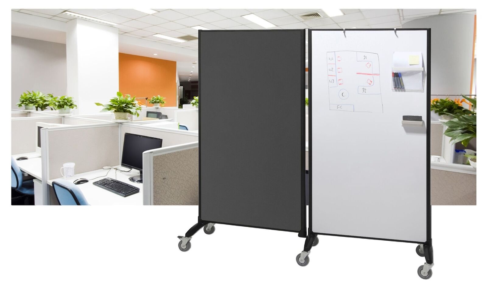
Learn moreAt JustBoards, we supply high-quality magnetic whiteboards built for performance.
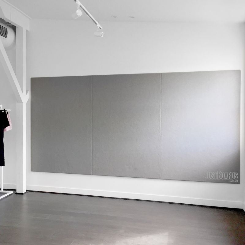
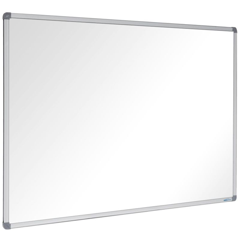
Porcelain Whiteboards – Ideal for schools and heavy-duty use with a 25-year surface warranty
Commercial Acrylic Whiteboards – Affordable and perfect for light to medium use with an 8-year warranty
Proudly Australian-owned and operated, JustBoards is trusted by schools, offices, and hospitality venues nationwide.
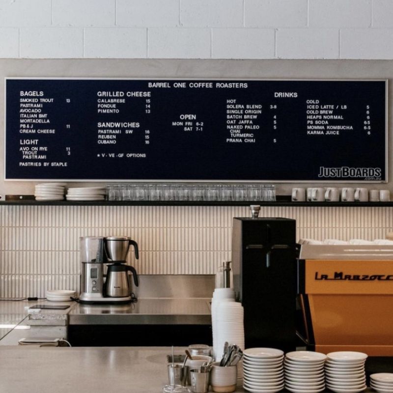
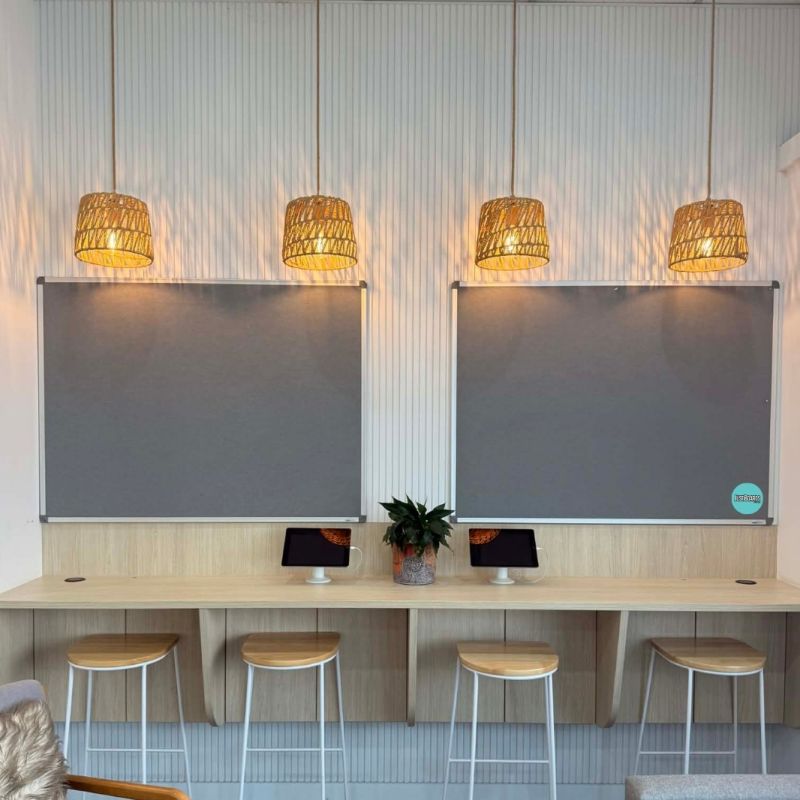
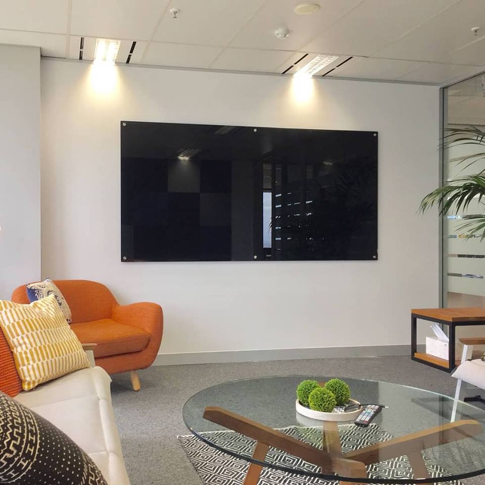
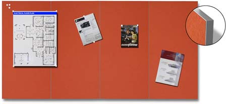
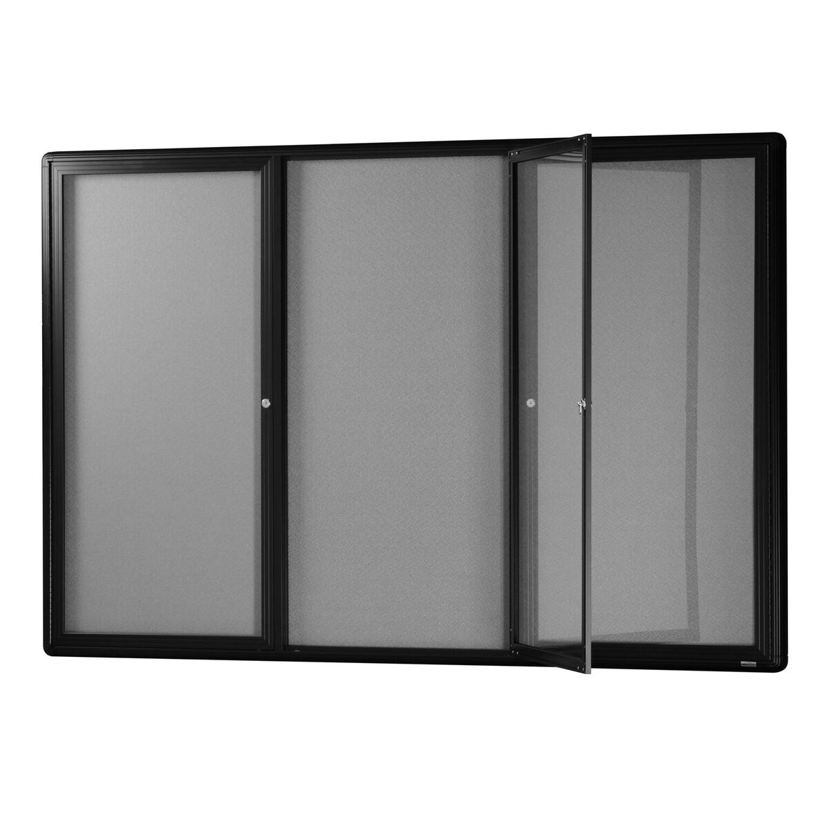
We provide fast Australia-wide delivery, expert service and product knowledge on our wide range of Whiteboards, Glass Boards, Notice Boards, and Educational Products
Based in Brisbane, we offer Australia-wide delivery with FREE ground floor shipping on all orders over $150 to all capital city metro areas and selected nearby suburbs.
We proudly supply a wide range of industries and organisations across Australia, including: Schools, Universities, Kindergartens & Child Care Centres Hospitals, Medical Centres & Aged Care Facilities Airports, Transport Companies & Mining Operations Local, State & Federal Government Departments Police, Fire, Ambulance, SES & Defence Forces Cafés, Restaurants, Pubs, Clubs, Coffee Shops & Resorts Banks, Cruise Lines & Shopping Centres
JustBoards is the go-to supplier of high-quality whiteboards, pinboards, glass boards, and display products across Australia.