When you’re looking for a whiteboard supplier, there are hundreds of businesses to choose from, both online and offline. With so many options, it can be difficult to hone in on the best alternative. So, it makes sense to draw up a short list of potential suppliers before deciding on who to go with.
Drawing up a Short List
Here are some important questions you should ask yourself when compiling your short list:

- Can the supplier deliver the whiteboard I want in the required timeframe?
- How long have they been in business?
- Are they financially secure?
- Is there social proof available that shows I can trust them?
Once you have answered these questions and formulated your short list, the next step is to come up with some criteria so you can make an informed decision about who your final choice will be.
There are several factors you need to consider. There are obvious ones like value for money and quality of the product. But it’s also important to give weight to how a business conducts itself in the marketplace.
A good whiteboard supplier will consistently demonstrate three important characteristics.
1. Accountability
No one likes admitting to a mistake. But mistakes inevitably happen in business, and it’s important that your whiteboard supplier takes responsibility if there are problems with product quality or issues with shipping like a delay or damage in transit.
Imagine that your whiteboard arrives and there are noticeable scratch marks on it. Because of the high-quality wrapping around the board, it’s clear to you the damage was caused before dispatch.
If your supplier is accountable, they’ll immediately take action to rectify the situation by offering a refund, a replacement or a cancellation of your order. They’ll go out of their way to make you feel like there is a fair outcome.
If on the other hand your supplier has no accountability, they are likely to deflect responsibility. They may try to blame the transporter or ask you if you were careless with unpacking the board after delivery.
The bottom line is a that a good supplier will own up to their mistakes and do something about them.
--- Drawing Up Your Shortlist ---
The best way to find out about a company’s accountability is to look at what people are saying about them – either on Facebook or in Google Reviews.
2. Capability
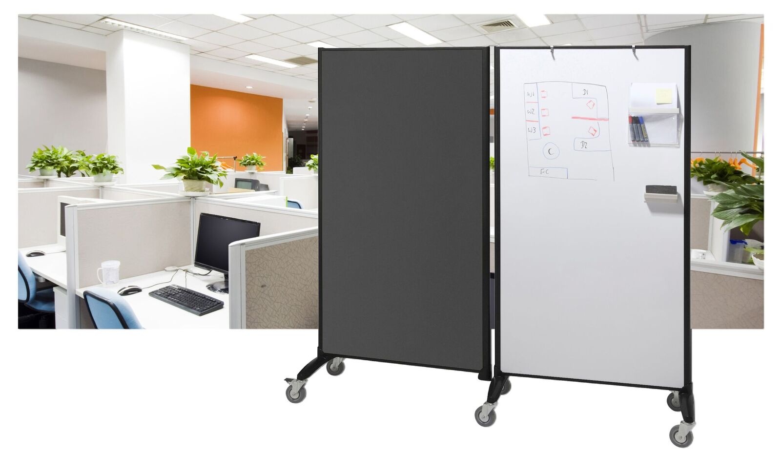
Capability is the capacity, expertise and materials a business has to perform its core function. A good whiteboard supplier’s core function is to provide a comprehensive suite of whiteboard options that can accommodate whatever a specific customer might require.
Don’t only think about what kind of whiteboard you need right now – also consider what boards you might need in the future.
If a supplier’s suite of options covers all of your definite and potential requirements, then they would be a good choice.
If you’re not sure about what kind of whiteboards you may need later on, you can ask yourself questions like:
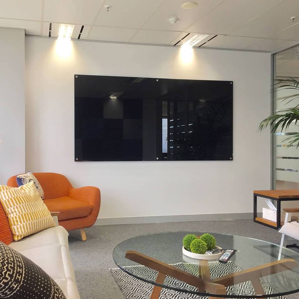
- Do they offer a choice of acrylic, porcelain and glass boards?
- Can you order custom boards?
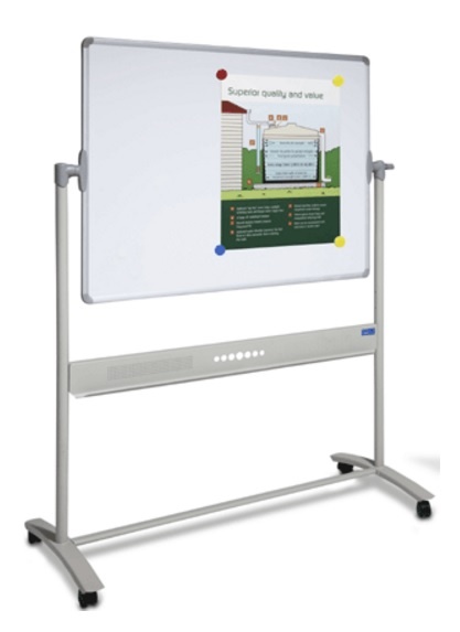
- Is it possible to buy mobile and wall mounted boards?
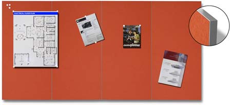
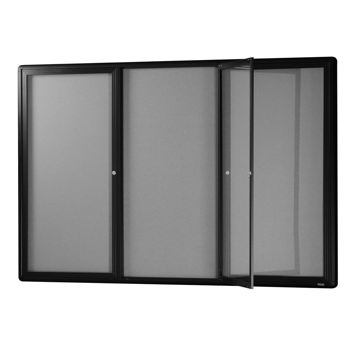
- Are specialist boards like monthly and yearly planners, printed graphic and matt projection boards available?
--- Drawing Up Your Shortlist ---
Look carefully at the information provided on a suppliers’ websites. Does the information provided answer the four questions above? If it does, are you satisfied with the quality of the ‘answers’ provided?

3. Good Communication
Communication is a fundamental part of any business transaction. It’s a huge plus to work with a whiteboard supplier that’s easy to communicate with – this means that business transactions are able to be completed with a minimum of fuss.
We’ve all been in situations where we’ve decided on a supplier and they’ve let us down when it comes to responding to phone calls or emails. A good whiteboard supplier would never allow you to feel this way.
You’ll notice things like effective teamwork, transparency in all discussions and a consistent spirit of cooperation when they communicate with you.
As a result of having positive encounters, you’ll build trust – the basis for building and maintaining an ongoing, long-term business relationship.
It will be easy to feel like they are the right fit for you and if that’s the case, you’ll feel confident about wanting to continue to do business with them.
--- Drawing Up Your Shortlist ---
What was the reaction to your initial enquiry? If it was by email, did they respond quickly? If it was by phone, was the person on the other end willing to spend some time answering your questions?
Why choose a JustBoards Whiteboard?
JustBoards will help you find the best solutions. We offer Australia wide delivery to your door. Contact us today on 1800 654 917 or at info@justboards.com.au.